I've been a bit busy, so I didn't post on the blog prior to last night's class. I'll try to post a longer post tonight to make up for it.
I’m really enjoying reading Norman’s Emotional Design. When I’m reading this book I’m constantly being reminded of other examples of design that I’ve read about or saw on TV, of which I’ll share a few in this blog posting. Norman begins Chapter 3 discussing the distinctive packaging of water bottles, and how design becomes the product. I’m not sure what Norman would say about this particular product, something definitely gets lost in translation.
The three levels that Norman discusses in the chapter are visceral, behavioral, and reflective. At the visceral level the physical dominates, so the look, the feel and sound are most important. The principles underlying visceral design are wired in, and are consistent across people and cultures. People go through these stages/questions when looking at a product designed to appeal to the visceral level: “I want it.” “What does it do?” “And how much does it cost?”. Norman raises some great examples of products that appeal to the visceral level, including iMacs, the VW Beetle, the Audi TT, and the Chrysler PT Cruiser.At the behavioral level performance matters. The most important components of the behavioral level include: function, understandability, usability, and physical feel. The key quote that jumped out at me was, “the first good step in good behavioral design is to understand just how people will use a product.” A lot of times designers/engineers are set in their ways, and they may not anticipate a need unless they observe it firsthand. There is a bit of a disconnect between designers and the people that they are designing their products, their intended audience. Norman also brings up numerous examples of products/innovations that designers have made in the past that even the designers didn’t anticipate their ultimate use, the classic example being Thomas Edison thinking that the phonograph would replace the need for people to dictate letters to one another.
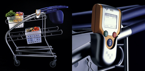
Norman mentioned a design firm called IDEO in this chapter, which reminded me of a story that Nightline did on this company in 1999. In this piece, Nightline gave the designers a task: redesign a shopping cart. The designers started out brainstorming issues/problems associated with the traditional shopping cart. At the end of the challenge the designers came up with this design:
An interesting approach indeed. Some of the advantages of this new design were increased maneuverability of the cart, plastic carts to hold groceries, and a scanning device that would ultimately allow people to do a self-checkout. Will this be the shopping cart of the future. Maybe, maybe not. Consumers who tested the product were concerned about forgetting to scan the products, and many also remarked that they missed the human exchange with the checkout clerk (personally, I could do without this part of grocery shopping).
For the purposes of brevity, I’m going to just respond to a couple of the readings, namely, Chapter 4 from Norman’s Emotional Design and the reading “What is interaction design?”.
In Chapter 4 of Emotional Design one particular quote spoke to me, and that was “technology should bring more to our lives than the improved performance of tasks: it should add richness and enjoyment.” One thing that I was really happy to see discussed also in this chapter was the Japanese bento box, and how it truly is an art form. Having lived in Japan for awhile, this discussion appealed to me because someone else appreciated the aesthetics and beauty of the presentation of food as it happens in Japan. Truly some bento boxes are “art meant to be consumed”.
Another part of Chapter 4 which I feel will be helpful in designing our project will be Patrick Jordan and Lionel Tiger’s work on designing pleasurable products that Norman alluded to in this chapter. This can be summarized as the following:
physio-pleasure (which appeals to the visceral and behavioral levels)
socio-pleasure (which appeals to the behavioral and reflective levels)
After reading Chapter 3 in Norman’s Emotional Design a few items struck me as being important when designing products. Thinking about designing a product that appeals to a consumer at a visceral, behavioral, and reflective level would be quite difficult. Norman points out that “no single design will satisfy everyone” due to variations in culture, personal tastes, and other factors. I found the reference to the Microsoft XBOX ad to be interesting: “Go outside. Get some air. Watch a sunset. Boy, does that get old fast.” Personally, I don’t remember these ads, maybe I’m outside the target demographic, and I’m not watching the right TV shows to see these ads, or I’m not reading the right magazines either. Which helps illustrate the point of market segmentation. Producers of mass consumed products know that they aren’t going to reach everyone, so they target their little market niche. Also, the XBOX ad pits the reflective level against the visceral and behavioral thrills that you can get from playing an XBOX game. Norman also points out that “with the large range of individual, cultural, and physical differences among the people of the world, it is impossible for a single product to satisfy everyone.” True. But what about products that seem to dominate the marketplace (no I’m not going to ge into the Mac vs PC thing again), but how do you explain the popularity of a product like the iPod in its various incarnations? Is it simply a matter of better marketing? Doesn’t the iPod’s popularity span various age demographic groups? Does emotional design have a role to play in the popularity of a product like the iPod?
Sometimes it seems to me that Apple is cannibalizing its own products too. Take for example the new iPod nano and iPod shuffle. It just looks like they decided to take an iPod and cut it in half. And as for the iPad, it's just a bigger version of the iTouch. Weird.
I also have some reactions to Kim Vicente's The Human Factor, Chapters 3 and 4. In these chapters Vicente is looking the human-tech ladder and specifically physical and psychological factors to consider when designing products. As I was reading Chapter 3's discussion of designing products for human bodies with a variety of physical characteristics, and specifically looking at ergonomically designed products for the hand, for some reason I made connections to the Sony Playstation controllers. Since its introduction with the PS One, Sony's controllers have remained remarkably similar.
There have been technical improvements along the way with this particular controller, with the PS3 controller having wireless BlueTooth capabilities and Sixaxis motion detection, ergonomically, not much has changed. The controller itself is fairly easy to hold, fitting comfortably in your hands, but you probably have to be about 5 or 6 years old in order to be able to hold it correctly (I know this because this the approximate age that my son started to play some video games on the PS2 and PS3). It actually feels good in your hands, and you can play for hours on end. This is an ergonomic design that is set up for comfort, because if it wasn't comfortable to hold in your hands, no one would want to play video games for very long. I'm sure that there was a lot of task analysis at work and observation as well, or they could have just looked at what the competitors were doing and modified their designs for the PS1 controller. There is alot of similarities between the arrangement of the buttons on a Super NES controller and the PS1 controller. It's like as if they copied their design and added a couple of handles and some analog sticks.
I also found the discussion of the Fender Stratocaster really interesting as well. Especially how Leo Fender allowed guitar players to play his prototypes and give him feedback which went into subsequent designs. If you are ever in Seattle, a visit to the Experience Music Project museum is a must-see because they have not only a history of rock 'n' roll music there, they have a lot of guitars on display, and you can see the evolution of effective designs.
Chapter 4 in Vicente's book focused on psychological human factor in the human-tech ladder. Products may work physically but if they are too much of a burden on our limited memory capacity, too complex, or counter-intuitive they will not be well-received. I was reminded of our automated telephone system for the CBE when you need to call in for a substitute. Itès called SEMS (Substitute Employee Management System). It is an automated phone message system, that at times seems hard to navigate. You can't anticipate the numbers that you will be asked to press next, because they do not seem logical. I loved the bit about the Magic Roundabout in Swindon. Personally, I really like Roundabouts, and wish we had more of them in Calgary. Although the Magic Roundabout might look confusing, I am sure that it helps traffic flow nicely. Reading this bit reminded me of the recent fiasco on one of my favorite reality TV shows, the Amazing Race. Race participants had to get themselves from Heathrow Airport in London to Stonehenge. It is not that difficult, trust me, but it was for people that could not read maps or make sense of the roundabouts to get on the proper highway to get to the Salisbury Plain. It is actually quite funny how so many of them had a hard time with the roundabouts and ended getting all turned around.


